🧾 New: Create Invoices. Request Direct Payments. FREE Download Now
Why Simpler Payment Forms Convert Better
Imagine spending hours setting up your WordPress site, crafting the perfect product or service page, and driving traffic to it, only to watch potential customers vanish the moment they hit your payment form. No purchase. No donation. No booking. Nothing.
This isn’t a rare edge case. It’s the everyday reality for thousands of WordPress site owners who don’t realise that the very payment form they built is the thing pushing people away.
The truth is blunt: complexity is a conversion killer. Every unnecessary field, every confusing layout, every moment of hesitation you introduce between a customer’s intent and their completed payment is a chance for them to abandon your site entirely. And they do, in staggering numbers.

In this article, we’ll unpack the reasons behind payment form abandonment, explore exactly what makes a form too complex, and show you why a simpler, smarter approach converts better.
The Reality: Most Payment Forms Are Losing You Money
Before we talk solutions, let’s look at the problem in hard numbers. The data from checkout and form research paints a grim picture for site owners who have settled for complex payment flows.
70%+ Global average cart/checkout abandonment rate across all e-commerce. 26% Of shoppers abandon specifically because the checkout process is too long or complicated. 23.5 Average number of form elements in a typical US e-commerce checkout, nearly double the optimal count
That last number deserves to sink in. The average checkout form has almost twice as many form elements as it needs. And according to Baymard’s large-scale usability testing, an ideal checkout flow can work effectively with just 12–14 form elements, or as few as 7–8 fields.
For WordPress site owners, this isn’t abstract e-commerce theory. Whether you’re accepting payments for services, collecting donations for your NGO, or running a small online store, the same friction rules apply. Every extra field is a micro-hurdle. And when you add enough micro-hurdles, people stop jumping.

What Makes a Payment Form ``Too Complex``?
Here are the most common complexity traps that WordPress site owners fall into, and why each one costs you conversions.
1. Asking for Information You Don’t Actually Need
This is the most widespread Form mistake. Site owners add fields “just in case” a second address line, a phone number, or a company name, without asking whether that information is actually necessary to process the payment.
The rule is simple: if you don’t operationally need it, don’t ask for it. Every optional field you include still creates a decision point for the user: do I fill this in or skip it? That micro-decision is friction.

2. Forced Account Creation
26% of shoppers abandon their cart when forced to create an account. This is one of the most reliably documented friction points in checkout research. Yet many WordPress payment setups still default to requiring registration before payment.
For direct payment scenarios, one-off services, donations, and event bookings, requiring account creation is rarely justified. The customer just wants to pay. Let them pay.

3. Payment Method Mismatch
61% Of consumers abandoned a purchase in 2024 because their preferred payment method wasn’t offered. This is the flip side of form simplicity; while you want fewer fields, you also need to offer the right payment methods. A form that accepts only credit cards will lose every customer who prefers PayPal, mobile money, bank transfer, or crypto.
The solution is to offer multiple relevant payment options without creating visual chaos. This is a design and UX challenge, not a reason to add complexity.

4. Poor Mobile Optimisation
A payment form designed for desktop will almost always perform poorly on mobile. Tiny input fields, horizontal scrolling, buttons too small to tap accurately, these are death by a thousand cuts on a smartphone screen.
Research shows that 39% of mobile users abandon checkout specifically because of difficulty entering personal information. If your form isn’t mobile-native by design, you’re leaving the majority of your potential payments on the table.

5. Unclear Error Messages and Validation
The password field has an average abandonment rate of 10.5%, the highest among common form fields. Email fields lose 6.4% of users. Phone number fields lose 6.3%.
When validation fails, and the error message is unclear or worse, when it clears all the user’s input, the frustration often pushes users to abandon entirely rather than correct the mistake. Real-time, inline validation that helps users fix errors as they go dramatically reduces this drop-off.

What a Simple, High-Converting Payment Form Looks Like
So what does “simple” actually mean in practice? Here’s the anatomy of a payment form built for conversion:
- Minimal required fields: Name, amount, payment method. That’s the core. Add only what your specific use case genuinely requires.
- Clear, single-purpose design: One action per screen. No distractions, no competing calls-to-action.
- Multiple Payment Methods: Curated to your audience — not every option available, but the right ones for your customers and geography.
- Mobile-first layout: Large tap targets, autofill-compatible fields, clean visual hierarchy on small screens.
- Immediate feedback: Real-time validation, clear error messages, and a confirmation message or redirect when payment is submitted.
- No forced registration: Let customers pay without creating an account.
- Trust signals: A brief description of what the payment is for and what happens next removes doubt at the moment of decision.
Notice what’s absent from that list: multi-step registration, exhaustive billing address requirements, mandatory phone numbers for services that don’t require callback, and every payment gateway you could possibly integrate. Restraint is the design principle.
How Direct Payments WP Puts This Into Practice
This is where Direct Payments WP becomes relevant as a direct solution to the problem we’ve been diagnosing. Direct Payments WP was built on a foundational insight that matches everything we’ve covered in this article: most WordPress site owners don’t need a complex payment gateway integration. They need a simple, clean form that gets paid.
Built for Simplicity From the Ground Up
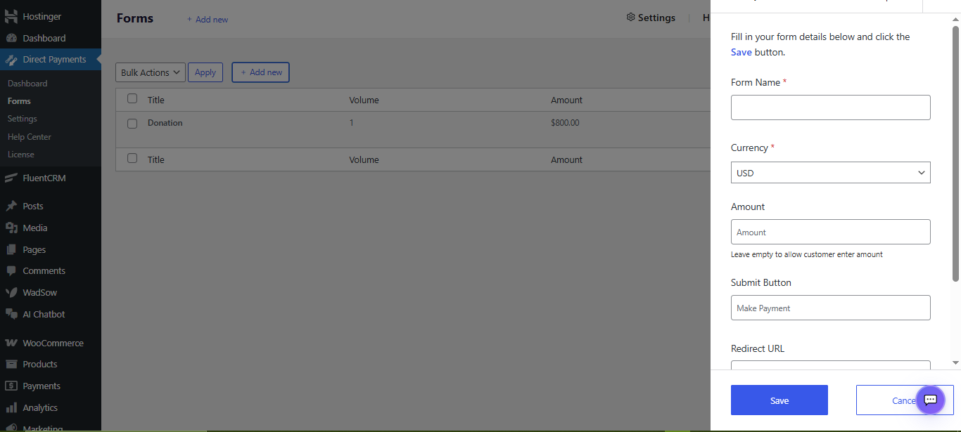
Unlike heavyweight payment plugins that require API keys, extensive configuration, and ongoing maintenance, Direct Payments WP is designed so that non-technical WordPress users can create a functional payment form in minutes, all without touching a line of code.
The setup process mirrors the optimal checkout experience it creates for your customers: streamlined, clear, and fast. You define the form name, set an amount (fixed or flexible), customise the submit button label, and optionally add a redirect URL for your thank-you page. That’s it.
100+ Payment Methods Without the Complexity
One of the most impressive things about Direct Payments WP is how it solves the payment method problem without adding complexity. The plugin supports 100+ local and global payment methods, including PayPal, Venmo, Zelle, Cash App, mobile money (MTN MoMo, Airtel), Bank Transfers, Google Pay, Apple Pay, Revolut, Payoneer, and cryptocurrency.
This matters enormously for conversion. Remember: 61% of consumers abandoned a purchase in 2024 because their preferred payment method wasn’t available. With Direct Payments WP, that problem simply doesn’t exist.

Zero Transaction Fees
Here’s a conversion factor that often gets overlooked: unexpected costs are the #1 reason for cart abandonment globally. Most payment plugins come with per-transaction fees that either eat into your revenue or get passed to the customer as a surcharge. Both outcomes hurt conversion. Direct Payments WP charges zero transaction fees. This means transparent, honest pricing for your customers and no unpleasant surprises at the final step.
Embedding Is as Simple as a Shortcode
One of the most overlooked friction points for WordPress site owners is the gap between building a payment form and actually getting it live on your site. Direct Payments WP handles this with a single shortcode: [direct_payment_wp id="1"]. Paste it anywhere on a page, a post, a widget area, and your payment form is live. No page builder dependencies, no theme conflicts, no code required.

Conclusion
In an era where digital attention spans are short and alternatives are one click away, every moment of friction you introduce is a business risk. The WordPress ecosystem is full of powerful, feature-rich plugins. But features aren’t always conversion-friendly. The best payment experience is one the user barely notices.
Direct Payments WP is built on this philosophy. It’s not the most feature-laden payment plugin in the WordPress repository. It’s the most purposefully simple one, designed to remove barriers between your audience and their completed payment, rather than adding configuration layers between you and your revenue.
That simplicity is, counterintuitively, its most powerful feature. Because when your payment form doesn’t make people think, doesn’t make people scroll, doesn’t make people wonder “is this safe?” or “do I really need to fill all this in?”, they complete it. And completed payments are the point.
Direct Payments WP is free to get started. Install it on your WordPress site today and build your first optimised payment form in under five minutes, no API keys, no coding, no complexity.
Visit the Direct Payments WP Landing page to get started, or read our step-by-step guide on How to Create a Donation Form in WordPress to see Direct Payments WP in action.
